Facebook
 X
X
 Pinterest
 Copy Link


The following analysis of the Western Washington real estate market is provided by Windermere Real Estate Chief Economist Matthew Gardner. We hope that this information may assist you with making better-informed real estate decisions. For further information about the housing market in your area, please don’t hesitate to contact your Windermere Real Estate agent.
REGIONAL ECONOMIC OVERVIEW
Just when we thought COVID was starting to pull back, the Omicron variant made its presence known. It is still too early to suggest that this has affected the region’s economic recovery—we won’t likely know for certain until we get more job data. I remain hopeful that this latest spike in infections will not have too much of an impact, but only time will tell. To date, the region has recovered all but 51,000 of the 297,000 jobs that were lost due to the pandemic. Some of the region’s smaller counties, including Grays Harbor, Cowlitz, Thurston, San Juan, and Clallam, have seen a full job recovery. The most recent data (November) shows the regional unemployment rate at a very respectable 3.3%, which is below the pre-pandemic low of 3.7%. The lowest unemployment rates were in King and San Juan Counties, where 2.9% of the labor force was out of work. The highest rate was in Grays Harbor County, which registered 5.1%. I still expect to see a full job recovery by this summer. However, there is a growing labor shortage holding the area back. Hopefully, this will change, but some industry sectors—especially hospitality—continue to find it hard to attract workers.
WESTERN WASHINGTON HOME SALES
❱ In the final quarter of the year, 22,161 homes sold, representing a drop of 5.2% compared to the same period in 2020 and down 18.8% from the third quarter.
❱ The reason there were lower year-over-year sales is simply because the number of homes for sale was down more than 30%. The drop between third and fourth quarters is likely due to seasonality changes in the market.
❱ Although home sales were lower in most markets, there was a significant uptick in Grays Harbor and Thurston counties. The number of homes sold dropped across the board compared to the third quarter.
❱ The ratio of pending sales (demand) to active listings (supply) showed sales outpacing listings by a factor of 5.2. The market is supply starved and unfortunately, it’s unlikely enough homes will be listed this spring to satisfy demand.

WESTERN WASHINGTON HOME PRICES

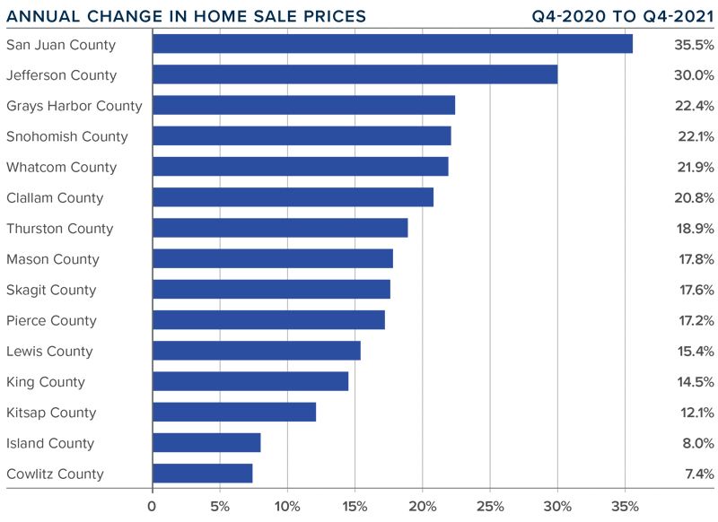
❱ Home prices rose 15.1% compared to a year ago, with an average sale price of $711,008. This was 2.1% lower than in the third quarter of 2021.
❱ When compared to the same period a year ago, price growth was strongest in San Juan and Jefferson counties. All but two markets saw prices rise more than 10% from a year ago.
❱ Relative to the third quarter, every county except Island (-8.6%), Mason (-5.2%), Lewis (-2.9%), King (-2.1%), Cowlitz (-1.7%), and Kitsap (-0.9%) saw sale prices rise.
❱ Mortgage rates rose more than .2% between the third and fourth quarters, which may have impacted prices. Affordability constraints continue to grow, which is also likely to have played a part in slowing gains.
DAYS ON MARKET
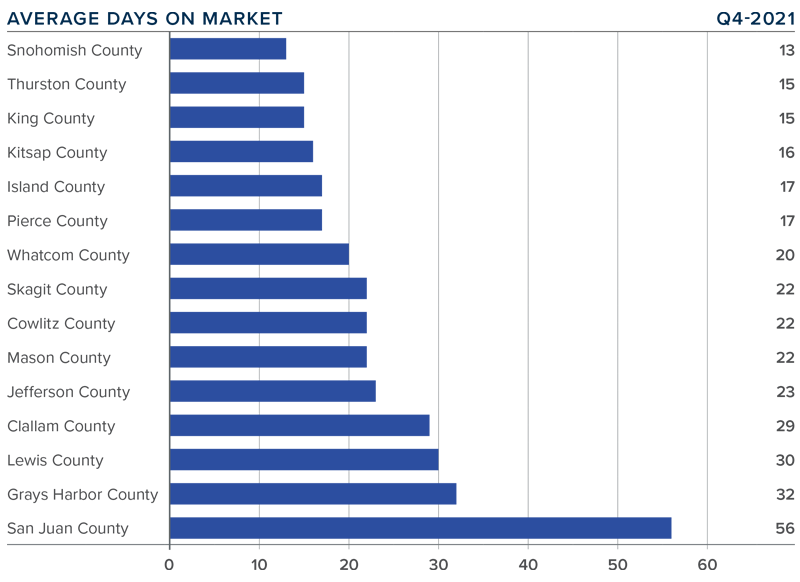
❱ It took an average of 23 days for homes to sell in the final quarter of 2021. This was 8 fewer days than in the same quarter of 2020, but 6 more days than in the third quarter of last year.
❱ Snohomish, Thurston, King, and Kitsap counties were the tightest markets in Western Washington, with homes taking an average of between 13 and 16 days to sell. The greatest drop in market time compared to a year ago was in San Juan County, where it took 33 fewer days for a seller to find a buyer.
❱ All counties contained in this report saw the average time on market drop from the same period a year ago. Every county except Whatcom saw market time rise compared to the third quarter.
❱ Longer days on market might suggest that things are starting to slow, but I don’t actually think this is the case. I believe buyers are being a little more selective before making offers, and many may be waiting in the hope that supply levels will improve in the spring.
CONCLUSIONS
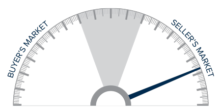
This speedometer reflects the state of the region’s real estate market using housing inventory, price gains, home sales, interest rates, and larger economic factors.
The housing market remains in a state of imbalance, but, as I look at the data, I believe the frenetic pace of sales and price appreciation may start to soften in 2022.
This will likely be due to financing costs and affordability acting as headwinds to price growth. Mortgage rates have started to rise again, and I have forecasted them to reach 3.7% by fourth quarter. This alone will slow price growth as affordability in many areas declines.
One thing that remains unknown that could have a significant impact on the market is long-term work-from-home policies. Many businesses have not yet determined their plans for remote working, but once they do, potential home buyers who have been waiting to see how frequently they have to commute to work could immediately start their search. In addition to boosting sales, this could add inventory to the market as well.
All things considered, I am moving the needle just a notch toward buyers. However, as you can see, we are still in a market that heavily favors home sellers.
ABOUT MATTHEW GARDNER

As Chief Economist for Windermere Real Estate, Matthew Gardner is responsible for analyzing and interpreting economic data and its impact on the real estate market on both a local and national level. Matthew has over 30 years of professional experience both in the U.S. and U.K.
In addition to his day-to-day responsibilities, Matthew sits on the Washington State Governors Council of Economic Advisors; chairs the Board of Trustees at the Washington Center for Real Estate Research at the University of Washington; and is an Advisory Board Member at the Runstad Center for Real Estate Studies at the University of Washington where he also lectures in real estate economics.